

Introduction
User experience (UX) is the backbone of any successful website. It’s not just about aesthetics—it’s about how users interact with your site, how easily they find what they need, and how smoothly they move toward conversion. Yet, many websites unknowingly sabotage their own success with poor UX decisions. Let’s see UX Mistakes That Are Killing Your Conversion Rates.
In this blog, we’ll explore the most common UX mistakes that hurt conversion rates and how to fix them. Whether you’re a designer, marketer, or business owner, understanding these pitfalls can help you create a more intuitive, engaging, and profitable digital experience.
1. Slow Page Load Times
Why It Hurts
Users expect fast experiences. A delay of even one second can lead to significant drop-offs. Slow load times frustrate users and increase bounce rates.
Fix It
- Optimize images and videos
- Minimize HTTP requests
- Use lazy loading and caching
- Choose a reliable hosting provider
Use tools like Google PageSpeed Insights or GTmetrix to diagnose and improve performance.
2. Poor Mobile Optimization
Why It Hurts
With mobile traffic surpassing desktop, a site that doesn’t work well on phones is a conversion killer. Pinching, zooming, or broken layouts drive users away.
Fix It
- Use responsive design frameworks
- Test across multiple devices and screen sizes
- Prioritize thumb-friendly navigation and tap targets
- Optimize mobile load speed
Mobile-first design isn’t optional—it’s essential.
3. Confusing Navigation
Why It Hurts
If users can’t find what they’re looking for, they won’t stick around. Overly complex menus, hidden links, or inconsistent layouts create friction.
Fix It
- Keep navigation simple and intuitive
- Use clear labels and logical groupings
- Include a search bar with autocomplete
- Ensure consistency across pages
Think of navigation as a roadmap—make it easy to follow.
4. Weak Call-to-Actions (CTAs)
Why It Hurts
CTAs guide users toward conversion. If they’re vague, hidden, or uninspiring, users won’t take action.
Fix It
- Use action-oriented language (“Get Started,” “Download Now”)
- Make CTAs visually distinct
- Place them strategically (above the fold, end of content)
- A/B test different versions
Every page should have a clear next step.
5. Overwhelming Forms
Why It Hurts
Long or complicated forms create friction. Users abandon them if they feel it’s too much effort or if privacy concerns arise.
Fix It
- Ask only for essential information
- Use multi-step forms for better flow
- Provide autofill and validation
- Clearly explain why data is needed
Simplify the process to increase completion rates.
6. Lack of Trust Signals
Why It Hurts
Users won’t convert if they don’t trust your site. Missing security badges, reviews, or contact info can raise red flags.
Fix It
- Display SSL certificates and secure payment icons
- Include testimonials and case studies
- Add real contact details and social proof
- Use professional design and copy
Trust is the foundation of conversion.
7. Inconsistent Design and Branding
Why It Hurts
Inconsistency confuses users and weakens brand identity. It can make your site feel amateurish or unreliable.
Fix It
- Use a consistent color palette, typography, and imagery
- Align design with brand voice and values
- Maintain layout consistency across pages
- Create a style guide for reference
Consistency builds familiarity and confidence.
8. Ignoring Accessibility
Why It Hurts
If your site isn’t accessible, you’re excluding a significant portion of users. This not only hurts conversions but can lead to legal issues.
Fix It
- Use alt text for images
- Ensure keyboard navigation
- Provide sufficient color contrast
- Use ARIA labels and semantic HTML
Accessibility is good UX—and good business.

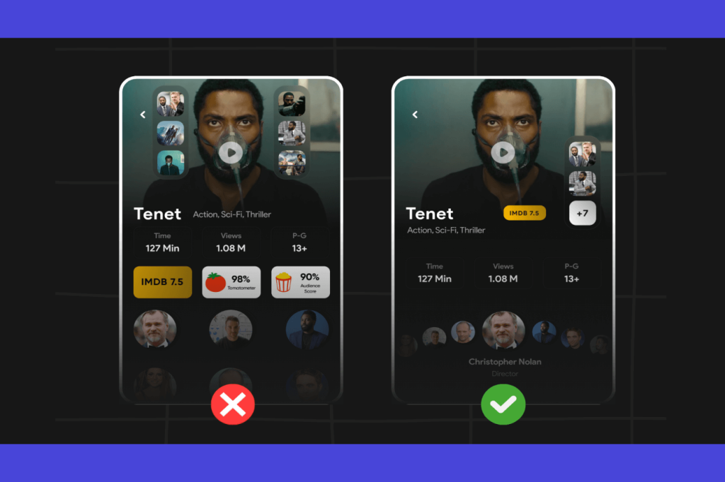
9. Cluttered Layouts
Why It Hurts
Too much content, ads, or visual noise overwhelms users. It distracts from the main message and confuses the path to conversion.
Fix It
- Embrace whitespace
- Prioritize content hierarchy
- Remove unnecessary elements
- Use grids and alignment for structure
Clean design improves focus and engagement.
10. Lack of User Feedback and Microinteractions
Why It Hurts
Users need feedback to feel in control. Without it, they may think the site is broken or unresponsive.
Fix It
- Use loading indicators, hover effects, and confirmation messages
- Provide error messages with clear instructions
- Add animations to guide user actions
Microinteractions enhance usability and delight.
11. Not Testing with Real Users
Why It Hurts
Assumptions can lead to flawed design. Without user testing, you miss critical insights into how people actually use your site.
Fix It
- Conduct usability testing with target users
- Use heatmaps and session recordings
- Gather feedback through surveys and interviews
- Iterate based on findings
Design for users—not just stakeholders.
12. Ignoring Analytics and Data
Why It Hurts
Without data, you’re flying blind. You won’t know what’s working or where users drop off.
Fix It
- Set up Google Analytics and conversion tracking
- Monitor bounce rates, exit pages, and funnel performance
- Use A/B testing to validate changes
- Create dashboards for ongoing insights
Data-driven design leads to smarter decisions.

13. Misaligned Content and Intent
Why It Hurts
If your content doesn’t match user intent, they’ll leave. Misleading headlines or irrelevant information break trust.
Fix It
- Align content with search intent and user goals
- Use clear, benefit-driven headlines
- Avoid clickbait or jargon
- Provide value upfront
Content should guide users toward action—not confuse them.
14. No Clear Value Proposition
Why It Hurts
Users need to know why they should choose you. If your value proposition is unclear, they’ll move on.
Fix It
- Highlight benefits, not just features
- Use concise, compelling language
- Place value proposition prominently (hero section, landing pages)
- Reinforce it throughout the user journey
Make your value obvious and irresistible.
15. Neglecting Post-Conversion UX
Why It Hurts
The user journey doesn’t end at conversion. Poor post-conversion UX can lead to buyer’s remorse or lost repeat business.
Fix It
- Provide confirmation and next steps
- Send follow-up emails or onboarding guides
- Offer support and feedback channels
- Encourage referrals or reviews
A great post-conversion experience builds loyalty.
Conclusion
UX isn’t just a design concern—it’s a business imperative. Every friction point, delay, or confusion can cost you conversions. By identifying and fixing these common UX mistakes, you can create a smoother, more enjoyable experience that turns visitors into customers.
Remember: great UX is invisible. It guides users effortlessly, builds trust, and drives action. Audit your site regularly, listen to your users, and keep refining. Your conversion rates—and your bottom line—will thank you.