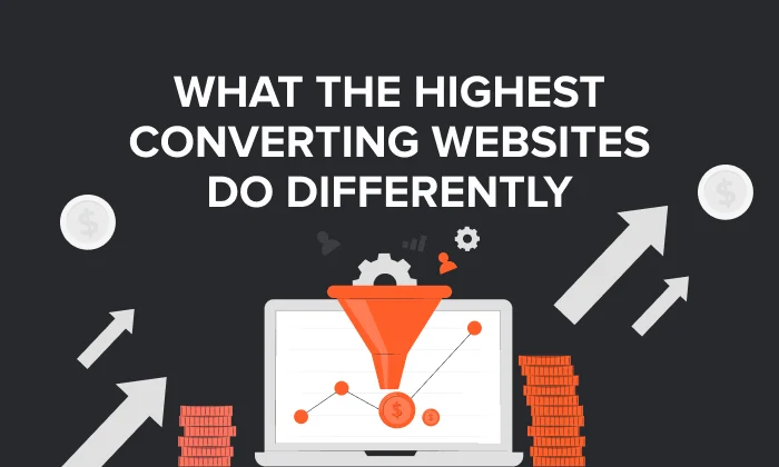
If your website looks great but isn’t generating leads, inquiries, sign-ups, or sales… you’re not alone. What Makes a Website “High‑Converting”? (Real UX Principles That Actually Move the Needle)
At Grocito, we see this all the time: businesses invest in design, development, even ads — but the website still feels like a digital brochure instead of a conversion machine.
So let’s fix that.
A high‑converting website isn’t about flashy animations, trendy layouts, or “make the button bigger.” It’s about something much simpler:
Reduce confusion. Reduce friction. Build trust. Guide action.
The Simple Definition: What “High‑Converting” Really Means
A website is high‑converting when it consistently turns visitors into the outcome you want:
- Book a call
- Request a quote
- Submit a lead form
- Start a trial
- Buy a product
And it does this without making visitors work hard, think too much, or hesitate.
In short: a high‑converting website makes the next step feel obvious and safe.
Need a quick conversion check?
Grocito Free UX Snapshot: We’ll review 1 key page (homepage or landing page) and share 5 practical fixes you can apply immediately.
The “High‑Converting UX” Framework: Clarity → Confidence → Action
If you remember only one thing from this blog, remember this:
- Clarity: “I get it.”
- Confidence: “I trust it.”
- Action: “I can do it easily.”
Most websites fail because one of these breaks. Let’s fix them one by one.
1) Clarity: Make Your Value Obvious in 5 Seconds
Visitors don’t read websites. They scan.
Your hero section (top of the page) should instantly answer:
- What do you do?
- Who is it for?
- What result do you deliver?
- Why should I choose you?
A high‑converting hero formula
- Headline: Specific outcome (“Get 2x More Leads With a Conversion‑Focused Website”)
- Subheadline: Who it’s for + how you help
- Primary CTA: One action (“Book a Call” / “Get a Quote”)
- Instant proof: Testimonials, client logos, results
Common mistake: using a clever slogan instead of a clear message. If someone needs to decode your headline, they’ll bounce.
2) One Page, One Main Goal (Stop Asking Visitors to Do 5 Things)
High‑converting pages are focused. They don’t multitask.
If your landing page asks people to:
- Read your story
- Watch a video
- Explore services
- Download a PDF
- And also contact you
…you’re creating decision overload.
Better approach: choose one primary conversion goal and build the whole page around it.
Grocito can build focused landing pages that convert
If you’re running ads or campaigns, we’ll design a dedicated landing page with one clear goal, strong message match, and a friction‑free conversion flow.
3) Visual Hierarchy: Design That “Directs” Attention
Great design isn’t decoration — it’s direction.
High‑converting pages make it easy to scan by using:
- Clear headings and subheadings
- Short paragraphs (2–3 lines)
- Bullet points for key benefits
- Strong spacing (white space reduces overwhelm)
- One primary CTA style
When people can understand your offer quickly, they’re more likely to take action.
4) Reduce Cognitive Load (Make It Easy to Decide)
Cognitive load is the mental effort required to use your site. The more effort it takes, the fewer people convert.
To reduce cognitive load:
- Use simple language (avoid jargon)
- Replace feature lists with benefits (“what’s in it for me?”)
- Keep navigation predictable and consistent
- Don’t hide important info behind extra clicks
Timeless usability principles like consistency, error prevention, and “recognition over recall” are still key to making interfaces feel effortless. ra Step Costs Conversions
Friction is anything that makes a visitor pause:
- Slow loading
- Long or confusing forms
- Unclear pricing/process
- Too many required fields
- Unexpected steps
Quick form upgrades that often improve conversions
- Ask only what you truly need
- Use clear labels and examples (e.g., “name@company.com”)
- Show errors inline, near the field
- Add reassurance under the CTA (“We reply in 24 hours. No spam.”)
In e‑commerce, Baymard’s long‑running research estimates that around ~70% of carts are abandoned on average, and many issues are solvable through checkout usability improvements.
Even if you’re not an online store, the lesson is universal: remove unnecessary effort.
6) Reduce Anxiety: Trust Converts More Than “Pretty UI”
Here’s a big truth:
Many visitors don’t convert because they’re unsure — not because they dislike your design.
High‑converting websites reduce anxiety with trust signals such as:
- Real testimonials (names, photos, company roles)
- Case studies and results
- Clear contact info
- Transparent pricing or “starting from” ranges
- “What happens next” explanations near the CTA
In checkout flows, trust and security concerns are documented as common reasons people abandon purchases.
7) CTA Copy That Feels Like a Win (Not a Task)
“Submit” feels like work.
High‑converting CTAs feel like a result:
- Get My Free Audit
- Book a 15‑Minute Call
- See Pricing
- Request Proposal
Bonus tip: add microcopy below the button to reduce anxiety:
- “No spam. Cancel anytime.”
- “We respond within 24 hours.”
- “No credit card required.”
8) Speed + Stability = Conversion (Not Just “Tech Stuff”)
Performance is part of UX. If your site is slow or jumpy, people lose confidence and leave.
Google’s Core Web Vitals define benchmarks for real-world user experience:
- LCP (loading): aim for ≤ 2.5 seconds
- INP (responsiveness): aim for ≤ 200 ms
- CLS (visual stability): aim for ≤ 0.1
These targets are documented by Google as recommended thresholds for good user experience.
Want a faster website (and better conversions)?
Grocito can optimize your website speed, fix layout shifts, improve mobile performance, and help you hit Core Web Vitals targets — without breaking your design.
9) Mobile‑First UX (Because Most Users Are on Phones)
A website can look perfect on desktop and still fail on mobile.
Mobile conversion best practices:
- Big tap targets (thumb-friendly buttons)
- Short sections and scannable layout
- Minimal typing (autofill, dropdowns)
- Fast loading on normal networks
10) Accessibility Improves Conversion (Not Just Compliance)
Accessibility makes your site usable for more people — and usually improves clarity for everyone.
WCAG 2.2 is the W3C recommendation for making web content accessible across devices and disabilities.st and readability
Need an accessibility-friendly website?
Grocito can audit your website for accessibility gaps and redesign key flows to be more inclusive (and more conversion-friendly).
A Simple High‑Converting Website Checklist (Quick Audit)
Clarity
- Can someone understand what you do in 5 seconds?
- Is your headline outcome-focused and specific?
- Is there one clear primary CTA?
Confidence
- Do you show proof (logos/testimonials/results)?
- Is your process or “what happens next” clear?
- Do you address objections (pricing, timeline, support)?
Action
- Are forms short and easy?
- Is the CTA repeated logically down the page?
- Are errors and confirmations clear?
Performance
- Is the site fast, stable, and mobile-friendly?
- Do you meet Core Web Vitals targets?
Final Thoughts: A High‑Converting Website Makes the Decision Easy
The best converting websites aren’t the most complex. They’re the most clear and confident.
Clarity reduces confusion.
Trust reduces anxiety.
Friction-free UX makes action effortless.
If your website isn’t converting the way it should, you don’t always need a full rebuild — sometimes you just need the right UX fixes in the right places.
Work with Grocito
We design and develop conversion-focused websites and apps — built to look great, load fast, and drive real business outcomes.
- UX Audit & Conversion Optimization
- Landing Page Design for Ads & Campaigns
- Website Redesign & Development
- Performance + Core Web Vitals Improvements
- Accessibility Audit (WCAG-aligned)
FAQ
What is a good website conversion rate?
It depends on your industry, traffic source, and offer. A better goal is improving your baseline through clarity, trust, and reduced friction — and measuring page-by-page improvements over time.
Do I need a full redesign to improve conversions?
Not always. Often, conversion wins come from improving messaging, hierarchy, CTAs, forms, page speed, and trust elements — without a full rebuild.
What’s the fastest way to increase conversions?
Start with: (1) clarify the hero section, (2) reduce form friction, (3) add proof near CTAs, and (4) fix speed and layout shifts. Core Web Vitals targets can guide performance improvements.


