


Introduction
Typography is more than just choosing fonts — it’s about crafting a visual language that speaks to your audience. In the food and beverage industry, where sensory appeal and emotional connection are key, typography trends plays a vital role in shaping how users perceive a brand online. From rustic serif fonts that evoke tradition to sleek sans-serifs that signal modernity, the right type choices can elevate a restaurant’s website from functional to unforgettable.
In this blog, we’ll explore the latest typography trends in food and beverage websites, analyze real-world examples, and offer actionable tips for designers and restaurateurs looking to make their digital presence more appetizing.
1. Why Typography Matters in Food & Beverage Branding
First Impressions Count
Typography sets the tone before a single word is read. A playful script font might suggest a cozy café, while bold sans-serifs can convey a high-end dining experience.
Emotional Connection
Fonts evoke feelings. In the food industry, this emotional resonance can influence appetite, trust, and brand loyalty.
Readability and UX
Menus, descriptions, and CTAs must be easy to read. Poor typography can lead to confusion, frustration, and lost conversions.
2. Trend #1: Handwritten and Script Fonts for Artisanal Appeal
Overview
Handwritten fonts mimic the look of chalkboard menus, handwritten recipes, or personal notes — perfect for brands that want to feel warm, authentic, and handcrafted.
Use Cases
- Bakeries and cafés
- Farm-to-table restaurants
- Organic food brands
Examples
- Le Pain Quotidien uses script fonts to emphasize its rustic, homemade vibe.
- Sweetgreen incorporates handwritten elements in its seasonal campaigns.
Tips
- Use sparingly for headings or accents
- Pair with clean body fonts for readability
- Ensure legibility across devices
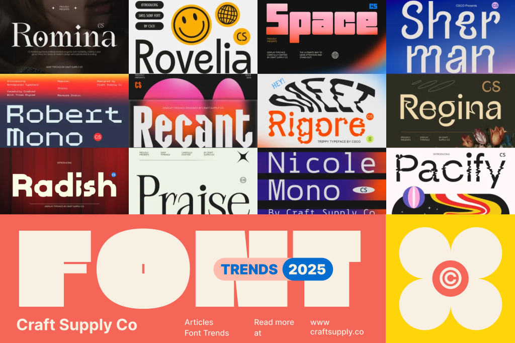
3. Trend #2: Bold Sans-Serifs for Modern Minimalism
Overview
Sans-serif fonts are clean, versatile, and modern. They’re ideal for brands that want to project confidence, clarity, and sophistication.
Use Cases
- Upscale restaurants
- Cocktail bars
- Fast-casual chains
Examples
- Chipotle uses bold sans-serifs to reinforce its modern, no-nonsense brand.
- Noma (Copenhagen) opts for minimalist typography to match its avant-garde cuisine.
Tips
- Use high contrast for visibility
- Combine weights for hierarchy
- Avoid overuse of all-caps
4. Trend #3: Serif Fonts for Heritage and Elegance
Overview
Serif fonts convey tradition, elegance, and trust. They’re often used by heritage brands or establishments with a long-standing reputation.
Use Cases
- Fine dining restaurants
- Wine brands
- Gourmet food retailers
Examples
- Eataly blends serif fonts with modern layouts to reflect its Italian heritage.
- The French Laundry uses classic typography to match its refined experience.
Tips
- Choose modern serifs for a fresh twist
- Use generous spacing for readability
- Avoid overly ornate styles
5. Trend #4: Variable Fonts for Dynamic Design
Overview
Variable fonts allow designers to adjust weight, width, and slant within a single font file — offering flexibility and performance benefits.
Use Cases
- Interactive menus
- Responsive layouts
- Seasonal campaigns
Examples
- McDonald’s has experimented with variable fonts in digital campaigns.
- Boutique brands use dynamic typography to adapt across devices.
Tips
- Use for responsive design
- Test across browsers
- Combine with animation for impact
6. Trend #5: Typography as a Visual Element
Overview
Some brands use typography not just for communication, but as a design feature — integrating type into imagery, layout, and branding.
Use Cases
- Trendy cafés
- Food trucks
- Pop-up restaurants
Examples
- Milk Bar uses oversized, playful typography as part of its visual identity.
- HelloFresh integrates bold type into packaging and web design.
Tips
- Balance type with imagery
- Use grid systems for alignment
- Ensure accessibility and contrast
7. Accessibility and Performance Considerations
Legibility Across Devices
- Use scalable units (em/rem)
- Avoid overly thin or condensed fonts
- Test on mobile and low-resolution screens
Contrast and Color
- Ensure sufficient contrast between text and background
- Avoid color combinations that hinder readability
Load Times
- Use web-safe fonts or host locally
- Limit font weights and styles
- Consider font subsetting
8. Pairing Fonts Effectively
Hierarchy and Contrast
- Use one font for headings and another for body text
- Combine serif and sans-serif for balance
Mood Matching
- Ensure fonts complement the brand’s tone
- Avoid clashing styles (e.g., playful script with rigid serif)
Consistency
- Maintain consistent font usage across pages
- Define styles in a design system or style guide

9. Tools and Resources for Typography in Web Design
Font Libraries
- Google Fonts: Free, fast, and reliable
- Adobe Fonts: Extensive library for Creative Cloud users
- Font Squirrel: Curated free fonts
Typography Tools
- TypeScale: Visualize font scales
- Fontjoy: Generate font pairings
- WhatFont: Browser extension to identify fonts
10. Future Typography Trends to Watch
AI-Generated Fonts
- Custom fonts created using machine learning
- Personalized typography based on user behavior
Motion Typography
- Animated text for storytelling and engagement
- Used in hero sections and promotional banners
Sustainable Typography
- Fonts optimized for low bandwidth and energy use
- Part of eco-conscious web design
Conclusion: Typography That Tastes as Good as It Looks
Typography is a powerful ingredient in the recipe for a successful food and beverage website. It influences perception, guides behavior, and reinforces brand identity. By staying current with trends — and applying them thoughtfully — designers can create digital experiences that are not only beautiful but also functional and memorable.
Whether you’re designing for a cozy café or a global food brand, the right typography can make your website feel as inviting as the dishes it represents.