
Introduction
Mobile commerce is booming, but so is mobile cart abandonment. Despite the convenience of shopping on smartphones, many users drop off at the final hurdle: checkout. Why? Because mobile checkout is often riddled with friction—tiny buttons, endless forms, confusing flows, and slow load times. In a world where attention spans are short and competition is fierce, optimizing mobile checkout UX is critical for e-commerce success.
This blog explores the psychology of mobile shoppers, common pain points in mobile checkout, and actionable UX strategies to reduce friction and boost conversions on small screens.
Section 1: The State of Mobile Checkout
- Mobile commerce stats: Over half of e-commerce traffic comes from mobile, but conversion rates lag behind desktop.
- Cart abandonment rates: Mobile abandonment is often 10–20% higher than desktop.
- Why it matters: Every improvement in mobile checkout UX can translate to significant revenue gains.
Section 2: Why Mobile Checkout Is So Challenging
1. Screen Size Limitations
- Less space for forms, buttons, and information.
- Easy to tap the wrong element.
2. Typing Friction
- Small keyboards, autocorrect errors, and form fatigue.
3. Distractions and Interruptions
- Notifications, calls, and multitasking.
4. Security Concerns
- Users are wary of entering sensitive info on mobile.
5. Slow Load Times
- Mobile networks can be unreliable.
Section 3: Key Principles for Reducing Friction
1. Simplicity
- Remove unnecessary fields and steps.
- Use clear, concise language.
2. Clarity
- Obvious CTAs, progress indicators, and error messages.
3. Speed
- Optimize for fast loading and quick interactions.
4. Trust
- Display security badges, trusted payment logos, and privacy assurances.
5. Accessibility
- Ensure checkout is usable for all, including those with disabilities.
Section 4: UX Strategies for a Frictionless Mobile Checkout
1. Guest Checkout
- Don’t force account creation.
- Offer social login or email-only checkout.
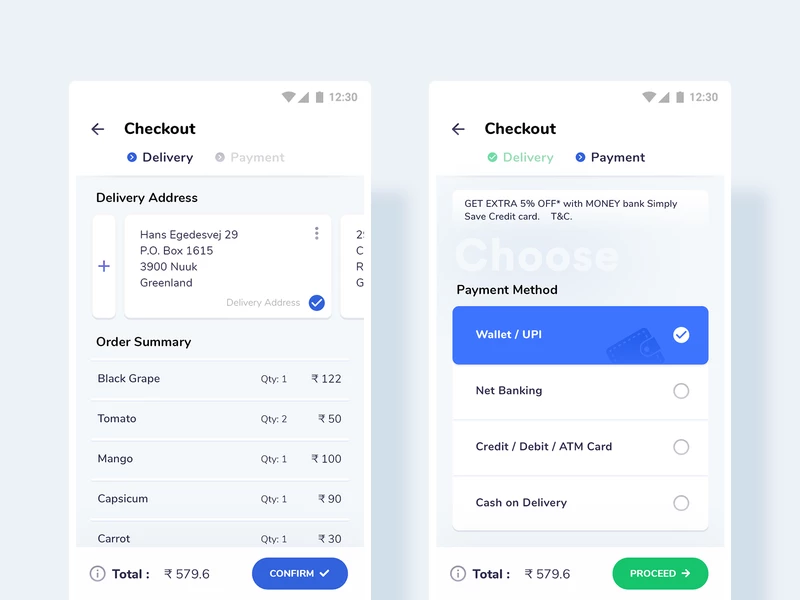
2. Progressive Disclosure
- Break checkout into bite-sized steps.
- Use a progress bar to show completion.
3. Auto-Fill and Input Optimization
- Enable browser and device autofill.
- Use the right input types (e.g., numeric keypad for phone numbers).
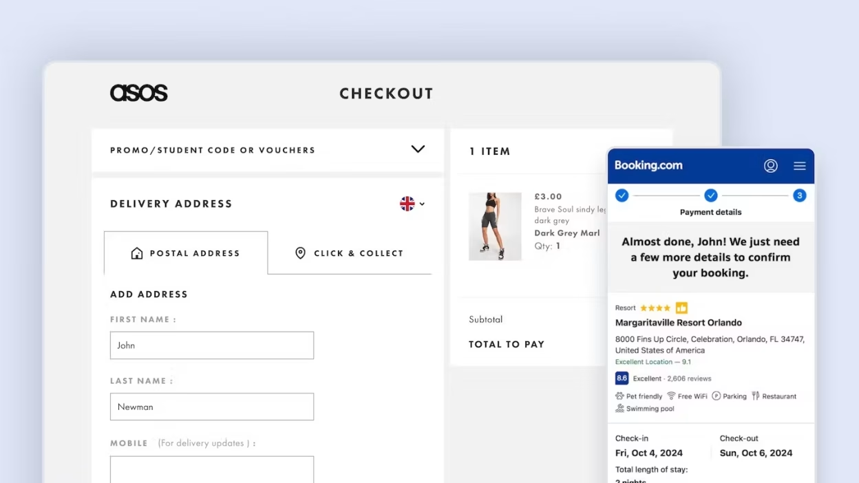
4. One-Click Payment Options
- Integrate Apple Pay, Google Pay, PayPal, etc.
5. Sticky CTAs
- Keep the “Checkout” or “Pay Now” button visible as users scroll.
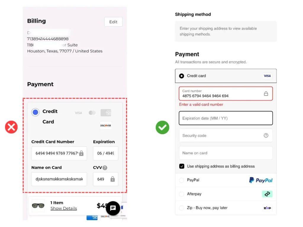
6. Error Prevention and Recovery
- Real-time validation and helpful error messages.
- Allow users to easily edit information.
7. Visual Hierarchy
- Highlight key actions and information.
- Use spacing and color to guide attention.
Section 5: Mobile-First Form Design
1. Short Forms
- Only ask for essential information.
- Use multi-step forms if needed.
2. Smart Defaults
- Pre-fill country, shipping, or payment info when possible.
3. Input Masks and Formatting
- Auto-format credit card numbers, phone numbers, etc.
4. Large Tap Targets
- Buttons and fields should be easy to tap, even with one hand.
5. Minimize Typing
- Use dropdowns, toggles, and address lookup APIs.
Section 6: Performance Optimization for Mobile Checkout
1. Fast Load Times
- Compress images, minimize scripts, and use lazy loading.
2. Offline Support
- Save progress if the connection drops.
3. Responsive Design
- Test on various devices and screen sizes.
4. Reduce Redirects
- Keep users on a single, streamlined flow.
Section 7: Building Trust and Reducing Anxiety
1. Security Badges and Payment Logos
- Show SSL, PCI compliance, and trusted payment options.
2. Transparent Pricing
- No hidden fees—show shipping and taxes upfront.
3. Clear Return and Support Policies
- Link to policies and offer live chat or support.
4. Social Proof
- Show reviews, ratings, and recent purchases.

Section 8: Testing and Continuous Improvement
1. A/B Testing
- Test different layouts, flows, and CTAs.
2. Analytics
- Track drop-off points and completion rates.
3. User Feedback
- Collect feedback via surveys or post-purchase emails.
4. Iterate and Optimize
- Regularly review and refine the checkout experience.
Conclusion
Reducing friction in mobile checkout is about more than just making things smaller—it’s about rethinking the entire experience for the realities of mobile use. By focusing on simplicity, speed, trust, and accessibility, brands can turn mobile browsers into buyers.
Start by identifying your biggest pain points, test solutions, and always keep the user’s needs at the center. In the fast-paced world of mobile commerce, a seamless checkout isn’t just a nice-to-have—it’s a competitive advantage.