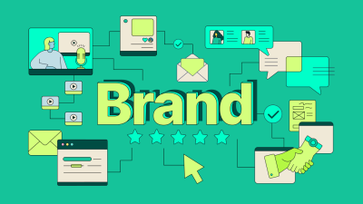
Ever clicked an ad that looked premium… and landed on a website that felt totally different? How to Design Marketing Creatives That Match Your Website (So People Actually Trust & Convert).
Yeah. It’s like meeting someone who looks sharp on Instagram but shows up to the meeting in a different personality altogether.
That “disconnect” is one of the fastest ways to lose trust — and conversions.
At Grocito, we build websites, apps, and design systems that are made to perform. And one of the biggest “hidden” performance boosts is simple:
Make your marketing creatives match your website.
When your ads, banners, social posts, emails, and landing pages feel like they belong together, your brand looks stronger, your message becomes clearer, and your customers feel safer taking action.
Why Matching Creatives + Website Matters (More Than You Think)
Your customer journey doesn’t start on your website. It starts on:
- Instagram / Facebook posts
- Google ads
- YouTube thumbnails
- Email headers
- WhatsApp promos
- Influencer creatives
- Marketplace banners
That’s where people form their first impression.
Then they click — and your website has a few seconds to answer:
- “Am I in the right place?”
- “Is this brand legit?”
- “Does this offer match what I just saw?”
If the answer feels like “maybe,” most people will bounce. Not because your product is bad — but because the experience feels inconsistent.
Consistency builds confidence. Confidence boosts conversions. And conversions grow your business. That’s the whole chain.
Want Grocito to review your creatives + website consistency?
We’ll spot the mismatches that are hurting trust and share quick improvements you can apply right away.
What “Matching” Really Means (It’s Not Just Colors)
When people hear “match,” they usually think:
- Same color palette
- Same logo usage
- Same font
That’s part of it — but real consistency goes deeper. A matching creative aligns in:
- Visual identity: colors, typography, imagery, icon style, spacing
- Messaging: promise, tone, words your brand uses (and avoids)
- Offer structure: what you’re selling + how it’s framed
- CTA language: the action feels familiar from creative → landing page
- User expectation: what the creative “implies” is what the website “delivers”
Think of it like a movie trailer. If the trailer looks like an action film but the movie is a slow drama, people will feel tricked — even if the drama is amazing.
The 3 Types of “Mismatch” That Kill Conversions
1) Visual Mismatch
Your ad looks clean, modern, minimal — but your website looks cluttered, inconsistent, or outdated.
2) Message Mismatch
Your creative promises “Get a Free Consultation” but the landing page pushes “Buy Now” with no consultation mentioned.
3) Experience Mismatch
Your creative suggests fast and easy (“Book in 1 minute”), but the website asks for 12 fields and 3 steps.
Fixing these mismatches often improves performance without increasing ad spend — because you stop leaking attention after the click.
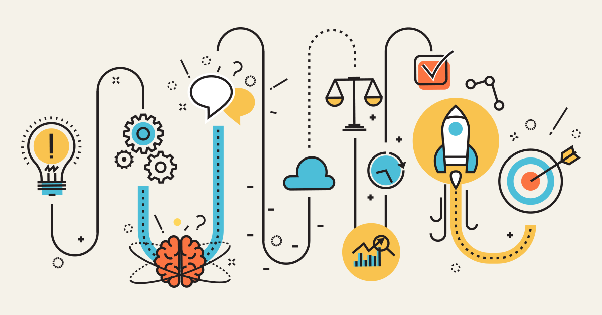
Step 1: Start With Your Website “Brand DNA”
If your creatives are all over the place, it’s usually because the brand foundation is unclear (or not documented).
Before designing more marketing creatives, define your website’s core identity:
- Primary brand colors (usually 1–2 strong ones)
- Secondary/support colors (for backgrounds, highlights)
- Typography (headline font + body font + usage rules)
- Button styles (shape, padding, corner radius, shadow)
- Photography/illustration style (real, minimal, bold, playful, etc.)
- Icon style (outline vs filled, rounded vs sharp)
- Tone of voice (friendly, premium, bold, calm, witty, etc.)
Friendly Grocito-style tip: If you can’t describe your brand in 3 simple words, your creatives won’t feel consistent.
Example brand words:
- Clean, friendly, modern
- Bold, energetic, direct
- Premium, calm, trustworthy
Need a simple brand kit that your team can actually follow?
Grocito can create a lightweight brand guide (colors, fonts, layouts, ad templates) so every creative looks like it belongs to the same brand family.
Step 2: Build a “Creative-to-Website” Consistency Checklist
Here’s a practical checklist we use while designing campaigns.
Visual Consistency
- Do the colors match the website palette?
- Does the typography feel similar to the website?
- Are spacing and alignment clean and consistent?
- Is imagery style consistent (photo vs illustration, tone, lighting)?
- Do icons/graphics match the website’s style?
Messaging Consistency
- Does the creative headline match the landing page headline?
- Is the offer the same (price, discount, freebie, package)?
- Is the tone of voice consistent (friendly, premium, bold)?
- Are the benefits aligned (same top 2–3 reasons to buy)?
CTA Consistency
- Does the CTA wording match (Shop Now vs Get Quote vs Book Call)?
- Does the landing page continue the same “next step” promise?
- Is the form/checkout friction aligned with the creative promise?
If you fix these, your marketing stops feeling like random posts and starts feeling like a real brand.
Step 3: Design Creatives Using Your Website Components
Here’s a cheat code: if your website already has a strong design system, don’t invent new styles for ads.
Instead, reuse your website’s building blocks:
- Use the same button colors and shapes
- Use the same heading styles
- Use the same card layouts
- Use the same icon set
- Use the same spacing rules
This instantly creates a “same world” feeling — and people trust what feels familiar.
Example: Website → Ad Translation
Website hero section:
- Big headline
- Short supporting text
- One primary CTA
- One trust cue (rating, testimonial, client logos)
Ad creative version:
- Short headline (1 big benefit)
- Micro subtext (who it’s for)
- CTA-style button (even if it’s non-click in the graphic)
- One trust cue (“500+ happy clients” or “4.8 rating”)
You’re basically creating “mini landing pages” in your creatives.
Step 4: Match the “Mood” and Not Just the Branding
Two designs can have the same colors and still feel completely different.
That’s because brand consistency also depends on:
- Energy level: calm vs high-energy
- Contrast: soft vs punchy
- Layout style: minimal vs dense
- Language style: playful vs professional
So ask: what mood does your website create?
- If your website feels premium and calm, your creatives should not feel noisy and shouty.
- If your website feels youthful and bold, your creatives shouldn’t feel corporate and stiff.
Friendly rule: If someone covers your logo, they should still feel it’s your brand.
Step 5: Keep Offer Details Consistent (Avoid “Trust Breaks”)
One of the most common mistakes we see is offer inconsistency.
Your creative says:
- “50% OFF today”
- “Free delivery”
- “Starting at ₹999”
But the landing page says something else… or doesn’t mention it clearly.
That creates doubt. And doubt kills conversion.
Offer consistency tips
- Repeat the same offer in the landing page hero
- Clarify conditions (if any) in simple language
- Don’t hide key details below the fold
- Make pricing feel transparent, not tricky
Running ads right now?
Grocito can design a matching landing page so your ads feel seamless from click to conversion.
Step 6: Make a “Template System” for Campaign Creatives
If every new creative starts from scratch, consistency will always be a struggle.
Instead, create a small set of templates. Not 50. Just a smart few.
Starter template set (high impact)
- Template 1: Offer + product/service highlight
- Template 2: Benefit-driven educational post
- Template 3: Social proof/testimonial
- Template 4: Before/after or case study snapshot
- Template 5: Announcement/event/webinar
Each template should define:
- Heading style
- CTA style
- Background style
- Icon style
- Spacing and alignment
This makes it easier for your team (or future designers) to create consistent marketing at scale.
Step 7: Align Social Media Creatives With Your Website Sections
Here’s a friendly trick that works amazingly well:
Make your social creatives look like “slices” of your website.
For example, your website likely has:
- A hero section (big promise)
- A benefits section (why you)
- A process section (how it works)
- A proof section (testimonials/case studies)
- An FAQ section (objections)
Now turn each section into a creative series:
- Hero series: 5 different headline creatives (same layout)
- Benefits series: 5 posts (one benefit per post)
- Process series: step-by-step carousel
- Proof series: testimonials in the same brand card style
- FAQ series: “People ask us…” posts
Result: everything feels like one consistent brand ecosystem.
Step 8: Use Consistent Image Treatment (This Is a Big One)
Even if you use the same colors, inconsistent photo style can make your brand look messy.
Pick an image direction and stick to it:
- Bright, natural lighting (friendly)
- Dark, dramatic lighting (premium)
- Minimal product shots on clean backgrounds (modern)
- Lifestyle photography (human, relatable)
- Illustration-based visuals (playful, techy, simple)
Quick consistency moves
- Use the same corner radius on image frames
- Use a consistent overlay style (if you add overlays)
- Keep background patterns consistent
- Use the same shadow style across creatives
These small details create a “designed” brand feel.
Step 9: Match Your Landing Page Layout to the Creative Format
Different creative formats create different expectations.
If the creative is a short, punchy offer:
- Landing page should be short and focused
- Above-the-fold should repeat the same offer clearly
- CTA should be immediate and obvious
If the creative is educational (“how to” or “tips”):
- Landing page should expand on the value
- Offer a next step (download, consultation, demo)
- Include proof and FAQs to convert warmer traffic
If the creative is social proof:
- Landing page should feature more proof quickly
- Case studies/testimonials should be easy to scan
- CTA should feel low-pressure (“Talk to us” / “Get a quote”)
Matching the experience to the creative improves the “flow” — and keeps users moving forward.
Want Grocito to build your campaign landing pages?
We design landing pages that feel like a natural continuation of your ad creatives — so clicks don’t get wasted.
Step 10: Keep Your Copy Style Consistent (Your Brand Voice Matters)
Design is one side. Words are the other.
If your website tone is friendly and simple, but your creatives sound corporate, it will feel off.
How to keep copy consistent
- Use the same “you” language
- Use similar sentence length (short + clear works best)
- Use the same terminology (don’t rename services every week)
- Keep CTA wording consistent across channels
Example (friendly tone)
- Instead of: “Submit your inquiry for consultation.”
- Try: “Tell us what you need — we’ll reply within 24 hours.”
When words feel familiar, people feel more comfortable taking the next step.
Step 11: Create a “Campaign Kit” (So Your Team Moves Faster)
If you run multiple campaigns, create a repeatable kit:
- Color palette and usage rules
- Font sizes for headlines/subheads/body
- Button styles + CTA text options
- Icon set
- Creative templates (post/story/banner)
- Landing page layout template
- Approved tone-of-voice examples
This saves time and keeps everything aligned. It’s also super helpful when multiple people create content.
Common Mistakes (And How to Avoid Them)
Mistake: Too Many Fonts
Fix: Use one headline font and one body font (max). Keep it clean.
Mistake: Random Colors for Every Campaign
Fix: Keep 80% brand colors, use 20% accent colors for variety.
Mistake: Creative Looks Premium, Website Looks Old
Fix: Update your website UI, spacing, typography, and visuals for a modern feel.
Mistake: CTA Says One Thing, Landing Page Does Another
Fix: Repeat the CTA and offer in the landing page hero section.
Mistake: Social Posts Are Fun, Website Feels Cold
Fix: Align tone with friendlier microcopy, images, and human elements.
A Quick “Match Test” You Can Do in 60 Seconds
Open your creative and your landing page side by side and ask:
- Do they look like the same brand?
- Do they feel the same mood?
- Is the offer identical?
- Is the CTA consistent?
- Would a new visitor feel confident?
If any answer is “no,” you’ve found a conversion leak.
Final Thoughts: Consistency Is a Conversion Strategy
Matching your marketing creatives to your website isn’t about being “perfect.” It’s about being recognizable, trustworthy, and easy to follow.
When your creatives and website feel like one story:
- people trust faster,
- they hesitate less,
- and they convert more.
And honestly? That’s the goal.
Work with Grocito
We’re a website & app development + design agency, and we help brands create marketing-ready digital experiences that look consistent and convert smoothly.
- Marketing Creative Design Systems & Templates
- Landing Page Design & Development
- Website Redesign for Better Brand Trust
- UI/UX Consistency Audit
- Brand Kit + Campaign Kit Setup
FAQ
Do my creatives really need to match my website exactly?
They don’t need to be identical, but they should feel like the same brand. The goal is continuity — so users don’t feel like they’ve landed somewhere unexpected.
What if I have different campaigns for different audiences?
You can create variations while staying consistent. Use the same base system (fonts, spacing, components) and adjust accent colors, imagery, and messaging per audience.
Can Grocito help if my website already exists?
Yes. We can audit your current website and creatives, identify the mismatches, and improve both — without forcing a full rebuild unless it’s needed.