

Introduction
Dark mode has evolved from a niche aesthetic preference to a mainstream design standard in 2025. With its sleek appearance, reduced eye strain, and battery-saving capabilities, dark mode is now a must-have feature across websites, mobile apps, and software platforms. But designing for dark mode isn’t just about flipping colors—it requires thoughtful UX decisions, accessibility considerations, and technical finesse. Let’s see Dark Mode Design: UX Benefits and Implementation Tips (2025 Edition).
In this blog, we’ll explore the UX benefits, implementation strategies, and best practices for dark mode design in 2025, helping designers and developers create visually stunning and user-friendly experiences.
1. What Is Dark Mode Design?
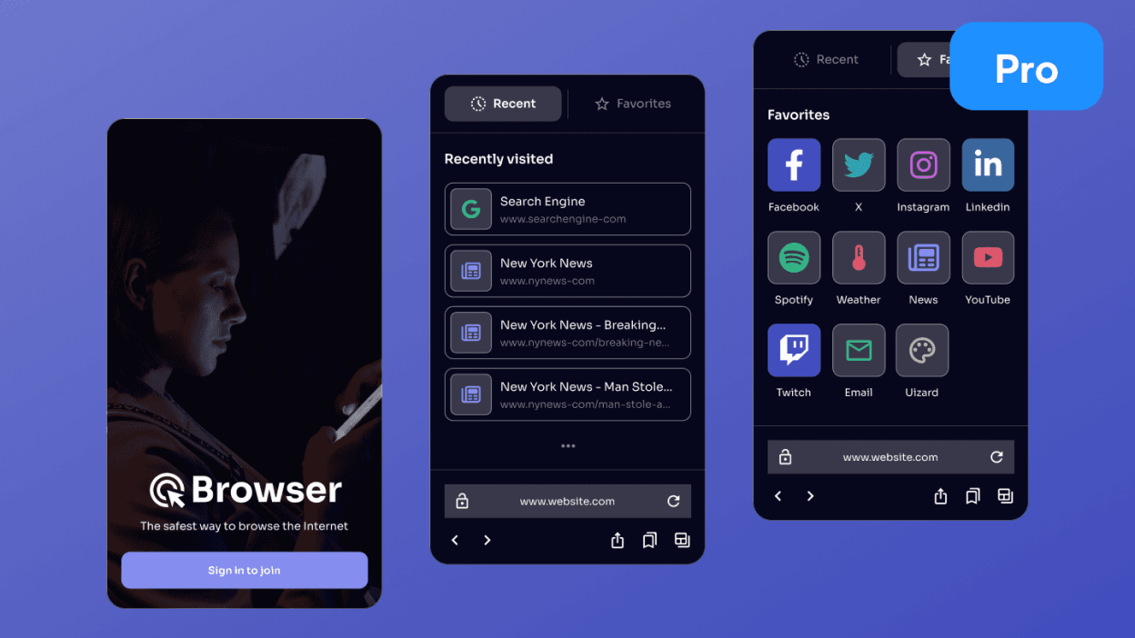
Dark mode refers to a user interface (UI) design where the background is dark (usually black or dark gray) and the text and UI elements are light-colored. It’s the inverse of traditional light mode and is often used to reduce screen glare and improve readability in low-light environments.
2. UX Benefits of Dark Mode
🌙 1. Reduced Eye Strain
Dark mode minimizes blue light exposure and screen brightness, making it easier on the eyes—especially in dim environments
This is particularly beneficial for users who spend long hours on screens.
🔋 2. Battery Efficiency
On OLED and AMOLED screens, dark pixels consume less power. Dark mode can extend battery life significantly, making it a preferred choice for mobile users
🎯 3. Enhanced Focus
Dark backgrounds reduce visual noise, allowing users to focus more on content. This is especially useful in productivity apps and reading interfaces
🖤 4. Aesthetic Appeal
Dark mode offers a modern, sleek look that appeals to many users. It’s often associated with premium and professional design aesthetics
♿ 5. Accessibility
For users with light sensitivity or visual impairments, dark mode can offer a more comfortable experience. When implemented correctly, it enhances usability for a broader audience
3. Challenges in Dark Mode Design
⚠️ 1. Color Contrast
Ensuring sufficient contrast between text and background is critical. Poor contrast can lead to readability issues and accessibility violations
1.
🖼️ 2. Image and Icon Optimization
Images with transparent backgrounds or dark tones may become invisible or unclear in dark mode. Icons and graphics must be adapted accordingly
🔄 3. Consistency Across Modes
Switching between light and dark modes should be seamless. Inconsistent UI elements can confuse users and degrade the experience
🧪 4. Testing Complexity
Dark mode requires additional testing across devices, browsers, and accessibility tools to ensure compatibility and performance

4. Best Practices for Dark Mode Design
🎨 1. Use Dark Grays Instead of Pure Black
Avoid using pure black (#000000) as it can be too harsh. Opt for dark grays like #121212 or #1E1E1E to create a softer, more readable background
✍️ 2. Light Text with Proper Weight
Use light-colored text (e.g., #FFFFFF or #E0E0E0) with sufficient font weight and spacing to enhance legibility. Avoid thin fonts and low contrast
🧩 3. Maintain Visual Hierarchy
Use accent colors and typography to guide users through the interface. Ensure headings, buttons, and links stand out appropriately
🧪 4. Test Contrast Ratios
Follow WCAG guidelines for color contrast (minimum 4.5:1 for normal text). Use tools like Stark or Contrast Checker to validate your design
🔄 5. Provide a Toggle Option
Allow users to switch between light and dark modes easily. A toggle switch improves accessibility and user control
🧠 6. Adapt Images and Icons
Use SVGs or dual-mode assets that adapt to both light and dark backgrounds. Ensure icons maintain visibility and clarity
🧰 7. Use CSS Variables for Themes
Implement dark mode using CSS variables and media queries. This allows dynamic switching and easier maintenance
:root {
  --bg-color: #ffffff;
  --text-color: #000000;
}

@media (prefers-color-scheme: dark) {
  :root {
    --bg-color: #121212;
    --text-color: #ffffff;
  }
}
5. Implementation Tips for Developers
🧱 1. Use Framework Support
Modern frameworks like React, Vue, and Flutter offer built-in support for theme switching. Leverage these tools for efficient implementation.
🧪 2. Dynamic Dark Mode
In 2025, dynamic dark mode adjusts based on ambient lighting or user preferences. Use JavaScript or system APIs to enable automatic switching
🧪 3. Test Across Devices
Ensure your dark mode works on desktops, tablets, and mobile devices. Use emulators and real devices for thorough testing.
🧪 4. Accessibility Testing
Use screen readers and accessibility tools to validate your dark mode design. Ensure all users can navigate and interact with your interface.
6. Current Trends in Dark Mode Design (2025)
✨ 1. Minimalist Interfaces
Clean, uncluttered layouts with ample spacing and subtle gradients are trending in dark mode design
🌈 2. Neon Accents
Bright neon colors (e.g., cyan, magenta) are used sparingly to highlight key actions and elements
🌫️ 3. Soft Gradients
Gradients add depth and dimension to dark backgrounds without overwhelming the user
🔘 4. Toggle Switches
Dark mode toggles are now standard in UI design, often placed in headers or settings menus

7. Case Studies
📱 Mobile App Example
A productivity app implemented dynamic dark mode using system preferences. Result: 25% increase in user retention and 40% reduction in support tickets related to eye strain.
🌐 Website Example
An e-commerce site redesigned its UI with dark mode and saw a 15% increase in nighttime conversions and a 20% drop in bounce rate.
8. Accessibility Considerations
✅ 1. Color Contrast
Ensure all text and UI elements meet WCAG standards.
✅ 2. Screen Reader Compatibility
Dark mode should not interfere with screen reader functionality.
✅ 3. User Preferences
Respect system-level dark mode settings and allow manual overrides.
Conclusion
Dark mode is no longer just a trend—it’s a UX necessity in 2025. When implemented thoughtfully, it enhances usability, accessibility, and aesthetics. By following best practices and staying updated with design trends, developers and designers can create dark mode experiences that delight users and drive engagement.
Whether you’re building a mobile app, a website, or a desktop platform, dark mode should be part of your design strategy. Embrace the shadows—and master the art of dark mode design.