Branding is a bit like choosing an outfit for a first meeting. You can show up in a clean, classic look (minimal) or make a strong statement (bold). Both can work brilliantly. Both can also go wrong—if they don’t match the situation. Minimal vs Bold Branding: Which Works Better for Your Industry?
So the real question isn’t “Which is better?”
It’s: Which style builds the most trust and desire for your audience, in your market, for your offer?
At Grocito, we help businesses design brands that look great and convert—across websites, apps, marketing creatives, and product UI. And one pattern we see constantly is this:
Brands choose minimal or bold based on personal taste… not customer psychology.
Let’s fix that.
This blog breaks down:
- what minimal vs bold branding really means (beyond “simple vs loud”)
- where each style wins (by industry)
- how to decide using a clear framework
- how to execute without looking generic (minimal) or messy (bold)
- real-world design rules for websites + apps + marketing creatives
No fluff—just practical guidance you can apply.
First: What “Minimal Branding” Actually Means
Minimal branding isn’t “boring.” It’s intentional reduction—removing everything that doesn’t support clarity, trust, and focus.
Minimal branding usually includes:
- lots of white space (breathing room)
- limited color palette (often 1 primary + neutrals)
- clean typography (usually sans-serif or modern serif)
- simple shapes and layouts
- restrained motion and effects
- fewer design elements—but higher quality
What minimal branding communicates:
- professionalism
- confidence
- premium quality
- calm and control
- clarity and ease
Minimal branding often feels like: “We don’t need to shout. We know we’re good.”
Now: What “Bold Branding” Actually Means
Bold branding isn’t just bright colors. It’s a high-contrast, high-personality approach designed to stand out and be remembered.
Bold branding usually includes:
- strong colors (often 2–4 with contrast)
- expressive typography (big headlines, unique fonts)
- high-energy layouts
- playful visuals, illustrations, patterns
- strong voice and punchy copy
- noticeable motion and micro-interactions
What bold branding communicates:
- energy
- uniqueness
- confidence
- modernity
- community vibe (often)
Bold branding feels like: “We’re different—and we want you to notice.”
The Biggest Myth: Minimal = Premium, Bold = Fun
Not always.
- A bold brand can be premium (luxury streetwear is bold).
- A minimal brand can be fun (minimal + playful microcopy can feel friendly).
- A minimal brand can look cheap (if it’s empty, not intentional).
- A bold brand can feel spammy (if it’s noisy, not designed).
So we need a smarter way to choose.
The Real Decision: What Do Your Customers Need to Feel?
Branding is emotional engineering. Your visual style should create the right feeling fast.
Ask this:
When someone sees your brand, what must they feel immediately?
- “This is trustworthy and safe.”
- “This is premium and high-quality.”
- “This is exciting and new.”
- “This is simple and easy.”
- “This is creative and different.”
- “This is expert-level.”
Minimal vs bold is simply a tool to create those feelings.
The “Fit Framework”: 6 Factors That Decide Minimal vs Bold
Here’s the framework we use when advising clients. Score each factor for your industry + audience.
Factor 1: Purchase Risk (How risky does this decision feel?)
- High risk purchase = often benefits from minimal trust cues
- Low risk / impulse = often benefits from bold excitement cues
Examples:
- High risk: healthcare, finance, legal, B2B software contracts
- Low risk: snacks, fashion drops, entertainment subscriptions
Factor 2: Attention Environment (Where do customers discover you?)
- Noisy platforms (Instagram, YouTube ads, outdoor) = bold helps you stop the scroll
- Calm environments (referrals, direct search, B2B outreach) = minimal can look more credible
Factor 3: Category Competition (Do you need to stand out or reassure?)
- If every competitor looks minimal, bold can differentiate
- If every competitor looks loud, minimal can feel premium and trustworthy
Factor 4: Audience Personality (What does your buyer prefer?)
- Corporate buyers often prefer clarity and calm
- Gen Z and creator audiences often reward personality and boldness
- Luxury buyers want control, restraint, and craft (can be minimal or bold, depending on niche)
Factor 5: Product Experience (Is your product complex or simple?)
- Complex product = minimal helps reduce cognitive load
- Simple product = bold helps amplify desire and personality
Factor 6: Brand Story (Are you “authority” or “movement”?)
- Authority brands often lean minimal (expertise + trust)
- Movement brands often lean bold (community + identity)
Now let’s apply this to industries.
Industry Breakdown: Minimal vs Bold (What Usually Works Better)
Important note: these are patterns—not rules. There are successful exceptions everywhere. But if you’re starting fresh, this gives you a high-probability direction.
1) Healthcare, Clinics, Wellness, Hospitals
Usually stronger: Minimal (with warm, human touches)
Healthcare is high trust + high risk. People want calm, clarity, and safety. Minimal branding supports:
- readability
- credibility
- low anxiety
- clean UI for forms and appointments
When bold can work here:
- modern wellness brands (fitness therapy, mental wellness apps)
- youth-focused clinics (dermatology, orthodontics)
- D2C supplements (if regulated and transparent)
Best combo:
Minimal base + bold accent
Example: mostly clean white layout + one confident accent color + friendly illustrations.
Not sure what style fits your industry?
Grocito can review your competitors and audience, then recommend a brand direction that looks right and converts better.
2) Finance, Insurance, Accounting, Legal
Usually stronger: Minimal
These categories rely heavily on trust. Bold branding can sometimes feel risky unless executed with serious restraint.
Minimal wins because:
- it feels stable and “adult”
- it reduces perceived risk
- it supports clarity (especially for pricing and policies)
When bold can work:
- fintech apps targeting younger users
- challenger brands with strong UX and transparency
- “finance made simple” products that need energy and approachability
Best combo:
Minimal structure + bold messaging
Clean UI, but confident copy and a strong accent color.
3) B2B SaaS, Enterprise Software, Tech Services
Usually stronger: Minimal (modern) or “minimal + bold accent”
B2B buyers want:
- clarity
- credibility
- proof
- structured information
Minimal design helps users understand complex offerings faster.
When bold works:
- developer tools with strong community branding
- product-led SaaS that relies on virality
- startups that want to feel disruptive
Best combo:
Minimal UI + bold brand moments
Example: calm product screens with one bold hero section, strong typography, and bright highlights.
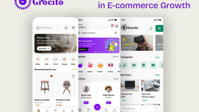
4) E-commerce (General Retail)
Depends heavily on category
But often: Bold performs better for discovery, minimal performs better for checkout trust
Why:
- Bold helps stop the scroll and build memorability
- Minimal helps reduce friction and improve conversion at checkout
Best approach:
Use bold branding in marketing and top-of-funnel pages, then use minimal clarity for product pages, cart, and checkout.
5) Beauty, Fashion, Lifestyle
Usually stronger: Bold (with strong consistency)
Lifestyle brands live on identity. People buy the vibe.
Bold branding helps with:
- differentiation
- memorability
- social content consistency
- community building
When minimal works:
- luxury beauty
- premium skincare clinics
- minimalist fashion labels
- brands selling “calm, clean, intentional living”
Best combo:
Bold visuals + minimal layouts
Big imagery, strong color/typography, but layouts stay clean and premium.
Want brand + website + creatives to match perfectly?
Grocito can design a consistent brand system that works across your website, app, and marketing creatives—without losing conversion focus.
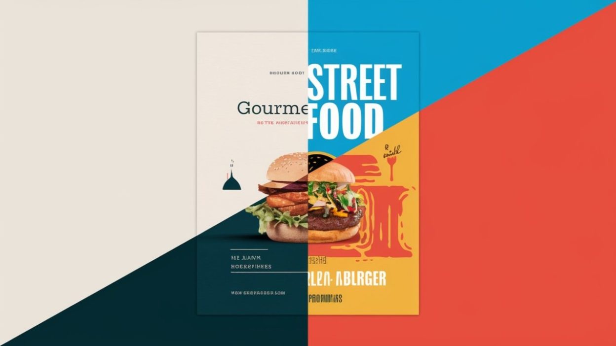
6) Food & Beverage, Restaurants, Cafes
Usually stronger: Bold
Food is emotional. Color, contrast, imagery, and personality matter a lot. Bold branding supports:
- appetite appeal
- impulse decisions
- social sharing
- memorability
When minimal works:
- premium cafes
- high-end restaurants
- boutique food brands (organic, minimalist packaging)
Best combo:
Bold visuals + consistent system (don’t go random). Use strong typography and food photography, but keep layout readable.
7) Education, Coaching, Courses
Often stronger: Minimal + warm personality (or bold for Gen Z)
Education requires trust, but it also needs motivation.
Minimal works well when:
- you sell premium coaching
- you serve professionals
- you need clarity in curriculum and outcomes
Bold works well when:
- you target students
- you sell short-format, high-energy learning
- you compete in crowded social media spaces
Best combo:
Clean structure + bold motivational highlights + human success stories.
8) Real Estate, Construction, Architecture, Interior Design
Split category:
- Real estate: often minimal
- Architecture/interiors: minimal or bold depending on style
- Construction: minimal trust cues are key
Why minimal often wins:
- high-ticket decisions
- need for credibility
- professionalism
When bold works:
- modern interior studios
- brands that sell “style and identity”
- Instagram-heavy discovery strategies
Best combo:
Minimal foundation + bold portfolio presentation.
9) Gaming, Entertainment, Events
Usually stronger: Bold
This is where bold shines:
- energy, hype, community
- high shareability
- strong identity cues
Minimal branding can work if you’re aiming for premium, cinematic, or luxury event positioning.
10) NGOs, Social Impact, Communities
Often stronger: Bold (but human, not aggressive)
People connect emotionally with causes. Bold visuals help:
- storytelling
- urgency
- recall
But keep trust high:
- show transparency
- avoid “over-designed” looks that feel fake
Best combo: warm bold palette + strong storytelling + simple donation flow.
The Hybrid Truth: Most Successful Brands Use Both
Here’s the reality: pure minimal and pure bold are rare at the highest-performing brands.
Most successful brands are hybrids:
- Minimal structure for usability and trust
- Bold accents for personality and recognition
Think of it as:
- Minimal is your foundation
- Bold is your spotlight
The 3 Branding Models You Can Choose (Easy Mode)
Model A: Minimal-First (Great for trust categories)
- Clean layout
- Neutral palette
- One accent color
- Simple typography
- Proof-heavy design
Best for: finance, healthcare, B2B, legal, high-ticket services
Model B: Bold-First (Great for attention categories)
- Strong color palette
- Big typography
- Expressive visuals
- Memorable patterns/illustrations
- Social-first creative system
Best for: fashion, food, entertainment, creator economy, youth brands
Model C: Minimal UI + Bold Identity (Best overall for many brands)
- Clean website/app UI for conversion
- Bold brand elements in hero, creatives, packaging, social
- Strong brand voice
Best for: e-commerce, SaaS, modern services, startups
Want the “best of both” approach?
Grocito can craft a hybrid brand system: bold enough to stand out, minimal enough to convert—across website and app.
Execution Rules: How to Do Minimal Branding Without Looking Generic
Minimal can look premium—or it can look like every template website ever made. Here’s how to do it right.
1) Use Quality Typography (Not Default Fonts)
Minimal design relies heavily on typography. If your type looks generic, the whole brand feels generic.
Minimal typography rules:
- pick 1 headline font + 1 body font (max)
- use a clear type scale (H1, H2, body, small)
- spacing matters more than fancy styles
2) Add “Signature Details”
Minimal needs a signature element:
- a unique icon style
- a distinctive grid
- a consistent corner radius
- a brand pattern used subtly
- a unique illustration style
- a recognizable photography direction
Minimal isn’t “empty.” It’s “intentional.”
3) Use Strong Imagery
Minimal brands often win with:
- premium photography
- clean product shots
- strong lifestyle visuals
- consistent lighting and editing
4) Don’t Remove Clarity
Minimal should never reduce clarity. If your minimal design hides:
- pricing
- process
- features
- navigation
…it becomes frustrating, not premium.
Execution Rules: How to Do Bold Branding Without Looking Messy
Bold branding can become chaos fast. Here’s how to keep it designed, not noisy.
1) Limit Your Boldness to a System
Bold isn’t random. It’s consistent.
Create rules:
- 2–4 brand colors (not 10)
- 1–2 font families
- consistent illustration/icon style
- consistent pattern usage
2) Use White Space Even in Bold Design
Bold doesn’t mean “fill everything.” White space gives bold elements room to shine.
3) Keep Readability Sacred
Bold brands often fail because text becomes hard to read.
Rules:
- ensure contrast
- avoid tiny text on busy backgrounds
- keep body text simple
- use bold type for headlines, not paragraphs
4) Choose One “Hero Element” Per Section
If everything screams, nothing is heard.
Per section, choose:
- one main message
- one main visual
- one main CTA
What About Websites vs Apps? (Important)
Brand consistency across website and app is where many businesses break.
Minimal vs bold in product UI:
- Apps usually benefit from minimal UI for usability
- Bold works best as accents: illustrations, highlights, onboarding, empty states, brand moments
- Overly bold UI can create friction (especially forms, checkout, dashboards)
Pro tip:
Use bold branding in:
- onboarding screens
- splash/intro moments
- hero headers
- marketing pages
Use minimal clarity in:
- navigation
- forms
- settings
- checkout
- dashboards
This keeps the experience easy while still feeling branded.
Quick Decision Quiz (Fast and Useful)
Answer these with “Yes” or “No”:
- Is your product/service high-ticket or high-trust?
- Do customers need to understand complex information?
- Do users compare you seriously before buying?
- Is your purchase decision high anxiety (health, money, safety)?
If you answered “Yes” to most → lean minimal.
Now:
- Do you rely on Instagram, ads, or social discovery?
- Do you compete in a crowded category where everyone looks similar?
- Is your audience young, trend-driven, or identity-driven?
- Is your product bought emotionally or impulsively?
If you answered “Yes” to most → lean bold.
If you got a mixed result → hybrid model (minimal UI + bold identity) is often perfect.
Common Mistakes When Choosing Minimal vs Bold
Mistake 1: Copying Trends Instead of Strategy
Trend-based branding fades fast. Strategy-based branding stays relevant.
Mistake 2: Choosing Bold Without a System
Bold without rules becomes messy. Messy reduces trust.
Mistake 3: Going Minimal Without a Signature
Minimal without character looks like a template. Template reduces memorability.
Mistake 4: Mismatching Brand and Offer
A playful bold brand selling serious legal services can confuse.
A super minimal brand selling youth streetwear can feel disconnected.
Mistake 5: Website and Marketing Don’t Match
If your ads are bold but your website is minimal (or vice versa), users feel the mismatch and lose confidence.
Want a clear recommendation for your industry?
Share your industry + target audience, and Grocito will suggest a branding direction (minimal, bold, or hybrid) with practical design rules you can follow.
A Practical “Brand Style Starter Kit” (Minimal or Bold)
No matter which style you choose, create these:
1) Brand Foundations
- brand words (3 words)
- mission / value promise (one sentence)
- tone of voice rules
- do/don’t examples
2) Visual System
- colors with usage rules
- typography scale
- spacing system
- icon/illustration style
- imagery direction
3) Component System (Website + App)
- buttons
- form fields
- cards
- badges
- headers
- navigation patterns
- states (loading, empty, error)
This is how you prevent brand drift.
Final Answer: Which Works Better for Your Industry?
Here’s the friendly conclusion:
- Minimal branding works best when trust, clarity, and premium credibility are the priority.
- Bold branding works best when attention, personality, and memorability are the priority.
- Hybrid branding (minimal structure + bold identity accents) is often the best choice for modern brands that want both conversion and differentiation.
So the winner isn’t minimal or bold.
The winner is: the style that makes your customers feel the right thing instantly.
Work with Grocito
We help brands choose the right direction (minimal, bold, or hybrid) and execute it across website, app, and marketing creatives—so it looks consistent and converts better.