
Let’s be honest: most people don’t leave your website because your product is bad. They leave because something feels uncertain. At Grocito, we look at trust as a system, not a single element. Reviews, badges, and guarantees Actually Improve Conversions—but only when they’re real, relevant, and placed correctly.
- “Is this brand legit?”
- “Will this work for me?”
- “What if I pay and it’s not worth it?”
- “Is it safe to enter my details?”
- “What happens after I click?”
That’s why trust design is one of the highest-impact upgrades you can make—often even bigger than changing colors, tweaking a CTA button, or adding more features.
This blog will show you what works (and what doesn’t), plus how to build a trust stack that turns “maybe later” into “let’s do this.”
A Simple Truth: Conversions Are Confidence + Clarity − Risk
Here’s the easiest way to think about trust:
People convert when they:
- Understand what you offer (clarity),
- Believe you can deliver it (confidence), and
- Feel safe doing it (low risk).
Reviews, badges, and guarantees directly affect confidence and risk.
So instead of thinking “we need more testimonials,” think:
“Where is the user feeling uncertain, and what proof reduces that uncertainty right there?”
That’s the heart of trust design.
The Trust Stack: The 3 Layers That Make People Feel Safe
A high-converting trust system usually has three layers:
1) Social Proof (Reviews & Results)
This answers: “Has this worked for people like me?”
2) Authority & Safety (Badges, Certifications, Security Cues)
This answers: “Is this legit and secure?”
3) Risk Reversal (Guarantees, Returns, Cancellation, Clear Policies)
This answers: “What if this doesn’t work for me?”
Most websites only do layer 1 (sometimes poorly). The best ones combine all three.
Risk-Reversal Offer Setup
Want help crafting a guarantee that increases conversions without hurting your business?
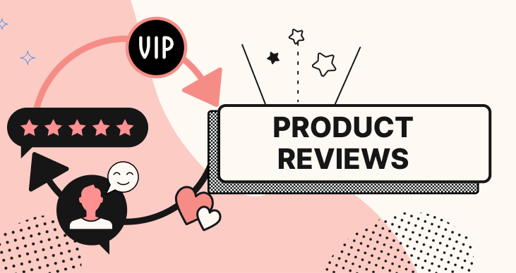
Part 1: Reviews That Work (Not Just “Nice Words”)
Why Reviews Convert
Reviews don’t just say “we’re good.” They help visitors imagine themselves succeeding.
But here’s the catch: not all reviews build trust. Some actually reduce it (especially when they feel fake, too generic, or too perfect).
The Reviews That Convert Best: 5 Characteristics
1) Specific (Not Fluffy)
Weak: “Amazing service, great experience.”
Strong: “We got 38% more leads in 6 weeks after the redesign. The new homepage is super clear.”
Specificity feels real—and gives the buyer something concrete.
2) Relevant to the Visitor
A visitor wants to see proof that matches their situation:
- same industry,
- similar budget range,
- similar problem,
- similar outcome.
If you’re a B2B agency, a review about “fast delivery” isn’t as strong as “they understood our requirements and executed cleanly.”
3) Includes a Before/After
Before: “Our site looked outdated and users dropped off.”
After: “Now inquiries doubled and navigation is simpler.”
Before/after is trust gold.
4) Has Identity Signals
Best reviews include:
- name,
- photo (optional but powerful),
- role,
- company name,
- location or industry.
Anonymous reviews can still help, but identity increases believability.
5) Includes Emotion + Outcome
People buy with emotion and justify with logic. A great review often includes both:
- Emotion: “We finally feel confident sending traffic to the site.”
- Outcome: “And we’re seeing more qualified leads.”
How to Collect Better Reviews (Without Being Awkward)
Most businesses ask for reviews at the wrong time.
Ask at the “Peak Happiness Moment”
That moment differs by business type:
For service businesses / agencies:
- after delivery and approval,
- after the first measurable result,
- after a milestone (launch, go-live, first campaign success).
For e-commerce:
- after delivery,
- after product use (not instantly after purchase).
For SaaS / apps:
- after a successful task,
- after reaching “aha” moment,
- after a few positive sessions.
Use a Simple Review Prompt
Instead of “please leave a review,” try:
“Hey [Name], quick question—what was the biggest win you got from working with us? One or two lines is perfect.”
This naturally produces specific reviews.
Give Review “Guiding Questions”
To get useful testimonials, ask:
- What problem were you facing before?
- Why did you choose us?
- What result did you get?
- What would you tell someone considering us?
You’re not scripting. You’re guiding.
Risk-Reversal Offer Setup
Want help crafting a guarantee that increases conversions without hurting your business?
Designing Review Sections That Actually Convert
A review is only as effective as how it’s presented.
1) Place Reviews Near Decision Points
Don’t hide testimonials on a separate page nobody visits.
Put them where doubt appears:
- near pricing,
- near “Add to cart,”
- near contact form,
- near checkout,
- near demo request CTA.
2) Use “Review Cards” That Are Easy to Scan
Good testimonial design:
- short headline (the outcome),
- 2–3 lines of supporting text,
- customer details below,
- optional rating indicator,
- optional logo.
People should get the point in 3 seconds.
3) Don’t Overload the Page
10 long reviews = no one reads them.
Better:
- 3 strong reviews on the page
- with a “See more reviews” expandable section if needed.
4) Add Outcome Tags for Fast Scanning
Example tags:
- “More leads”
- “Faster checkout”
- “Better conversions”
- “Faster load time”
- “Clear communication”
These help visitors instantly find the proof that matches their goal.
5) Use Video Testimonials (Only If They’re Natural)
Video builds trust faster when it feels genuine. But avoid over-produced videos that feel like ads.
Even a simple, well-lit video from a real client can outperform polished productions.
The Most Common Review Mistakes (And Quick Fixes)
Mistake: Fake-sounding reviews
Fix: ask clients for “before/after + measurable outcome.”
Mistake: Only 5-star reviews with no detail
Fix: include long-form reviews, screenshots of feedback, or case study snippets.
Mistake: Reviews that don’t match the offer
Fix: segment reviews by service/product category.
Mistake: Reviews placed too low on the page
Fix: include 1–2 trust signals above the fold, then deeper proof near CTA.
Part 2: Badges That Work (and Badges That Hurt)
Badges can build trust instantly—but only if they mean something to the user.
What Badges Are Really For
Badges reduce anxiety around:
- security,
- credibility,
- legitimacy,
- quality standards,
- payment safety,
- privacy.
Badges work best when they answer a specific fear:
- “Is it safe to pay?”
- “Is this brand verified?”
- “Will I get support?”
- “Will my data be safe?”
The Badges That Typically Perform Well
1) Payment & Security Badges (Especially for Checkout)
- Secure payment
- SSL secured
- Trusted checkout
- Encrypted transactions
The key is placement:
- near payment fields,
- near “Place Order” button,
- near form submission areas.
2) Industry Certifications / Recognitions
If you have legitimate certifications, they can be powerful:
- compliance standards,
- industry awards,
- verified partner programs.
But only show what you can back up.
3) Support & Service Badges
- “24/7 Support”
- “Priority Support”
- “Fast Response”
- “Dedicated Manager”
These reduce risk for service purchases and subscriptions.
4) Shipping / Delivery Badges (E-commerce)
- free shipping
- easy returns
- fast delivery
- cash on delivery (where relevant)
These are trust signals disguised as convenience.
Risk-Reversal Offer Setup
Want help crafting a guarantee that increases conversions without hurting your business?
Badge Design: The Rules That Prevent “Scammy” Vibes
Badges can backfire if they look cheap, outdated, or too loud.
Rule 1: Use Fewer Badges, But Make Them Meaningful
5 strong badges > 15 random ones.
Rule 2: Keep Badge Style Consistent with Your Brand
If your website is minimal and modern, neon badges will feel untrustworthy.
Consistency = legitimacy.
Rule 3: Use Simple Labels
Good:
- “Secure Checkout”
- “Verified Payments”
- “Easy Returns” Bad:
- “Ultra Secure 100% Guaranteed Trusted Safety Badge 2025”
Too much language sounds like trying too hard.
Rule 4: Put Badges Where They’re Relevant
Security badges should not be in the hero section. They belong near:
- forms,
- checkout,
- login,
- payment steps.
Rule 5: Don’t Use Fake or Unverifiable Badges
If users suspect it’s fake, trust drops fast.
If you’re unsure whether a badge is appropriate, keep it out.
Part 3: Guarantees That Work (Risk Reversal That Feels Real)
Guarantees are one of the most underused conversion tools, especially for service businesses.
Because people don’t just fear “losing money.” They fear:
- wasting time,
- making the wrong decision,
- looking foolish,
- dealing with refunds/support stress.
A great guarantee reduces that fear.
Types of Guarantees That Convert Well
1) Money-Back Guarantee (Simple, Powerful)
Works best for products, subscriptions, and standardized services.
But it must be clear:
- how long the guarantee lasts,
- what conditions apply,
- how refunds work.
Confusing guarantees reduce trust.
2) Satisfaction Guarantee (Service Businesses)
Example: “If you’re not happy after the first draft, we’ll revise it until it meets the agreed scope.”
This reduces fear of “what if they don’t get it right?”
3) Performance-Based Guarantee (Careful, But Strong)
Example: “If we don’t deliver the agreed milestones by the deadline, you get X discount.”
Don’t guarantee outcomes you can’t control (like “rank #1 in 7 days”).
Guarantee what you can control: timelines, deliverables, quality process.
4) Trial / Demo / Free Audit (Soft Guarantee)
A free audit, demo, or consultation is a trust bridge:
- “Try before you commit.”
This is often perfect for agencies and B2B services.
5) Easy Cancellation Guarantee (Subscriptions)
“Cancel anytime in 2 clicks.” This reduces commitment fear.
Risk-Reversal Offer Setup
Want help crafting a guarantee that increases conversions without hurting your business?
Guarantee Design: How to Present It So It Feels Trustworthy
The design of your guarantee matters almost as much as the guarantee itself.
1) Use Human, Simple Language
Avoid legal-heavy text first. Lead with the plain-English promise.
Example: “Not happy? We’ll fix it. If we can’t, we’ll refund you.”
Then add small details below.
2) Add a Visual Seal (But Keep It Modern)
A small, clean guarantee badge can increase attention. But avoid overly flashy “gold seal” graphics unless your brand style supports it.
3) Place Guarantee Near Price + CTA
Guarantees reduce risk right at the moment of decision.
Best placement:
- pricing section,
- next to “Buy now”,
- next to “Book a call”,
- near checkout summary.
4) Clarify “How It Works”
Add a 2–3 step explanation:
- Contact support
- We review within 24 hours
- Refund or fix offered
This removes fear of complicated processes.
The “Trust Map”: Where to Place Trust Signals on Key Pages
Here’s a practical placement guide.
Homepage
Goal: Make visitors feel confident you’re real, relevant, and capable. Use:
- one strong proof line near the hero,
- a quick testimonial snippet,
- client logos (if applicable),
- a short “how it works” section,
- link to case studies/work.
Service Page / Landing Page
Goal: Reduce doubt and increase commitment. Use:
- testimonials relevant to that service,
- outcome bullets (benefits + proof),
- process clarity,
- guarantee or risk reducer near CTA,
- FAQs that address objections.
Pricing Page
Goal: Reduce “what if I choose wrong?” Use:
- plan comparison clarity,
- “what’s included” details,
- guarantee near pricing,
- support badge (“help available”),
- testimonials that mention ROI/value.
Checkout / Form Page
Goal: Reduce anxiety. Use:
- security badges near payment/form,
- “what happens next” microcopy,
- refund/return policy summary,
- support contact options,
- trust icons (secure, encrypted, verified).
App Download Page / App Store Listing
Goal: Increase confidence fast. Use:
- ratings,
- review snippets,
- benefits-focused visuals,
- clear onboarding expectations,
- privacy reassurance.
Microcopy: The Tiny Trust Boost Most People Forget
Microcopy is the small text that reassures users at key moments.
Examples that work really well:
- Under a form button: “We’ll reply within 24 hours.”
- Under email field: “No spam. Ever.”
- Under payment button: “Secure checkout. Encrypted payments.”
- Near pricing: “Cancel anytime.”
- Near booking: “No commitment. Just a quick call.”
These don’t look like “trust design,” but they reduce anxiety massively.
Don’t Overdo It: When Trust Signals Backfire
Yes, trust signals can hurt conversions when they feel forced.
Signs your trust design is “too much”
- Too many badges everywhere
- Every section screams “TRUSTED! VERIFIED! SAFE!”
- Fake-looking testimonial photos
- Only perfect reviews with no detail
- Popups begging for reviews or showing “5 people bought this now!” constantly
The user’s brain reads this as: “Why are they trying so hard to convince me?”
Trust is calm. Confidence is quiet.
Trust for Different Business Types (Quick Guidance)
E-commerce
Focus on:
- reviews on product pages,
- shipping + returns clarity,
- secure checkout cues,
- delivery expectations,
- guarantee/return messaging.
SaaS / Apps
Focus on:
- clear onboarding value,
- trials/demos,
- security/privacy reassurance,
- reviews + real use-cases,
- customer logos and metrics.
Agencies / Service Businesses
Focus on:
- case studies,
- process clarity,
- proof of results,
- “what happens next” reassurance,
- satisfaction guarantee or risk reducer.
Local Businesses
Focus on:
- local reviews,
- photos of real work/location,
- easy contact,
- trust badges that matter locally (warranty, service guarantee),
- simple “book now” confidence.
Risk-Reversal Offer Setup
Want help crafting a guarantee that increases conversions without hurting your business?
Testing Trust: How to Know What’s Working
You don’t need complicated testing to improve trust signals. Start with simple observation:
Measure:
- bounce rate on landing pages,
- click-through to pricing/checkout,
- form completion rate,
- checkout abandonment,
- time on page for key pages.
Quick experiments to try:
- Add 2 strong testimonials above the fold
- Add a guarantee near pricing CTA
- Add security microcopy near checkout button
- Replace generic reviews with specific outcome reviews
- Reduce badge clutter and keep only meaningful ones
Friendly tip: Test one change at a time. Otherwise you won’t know what moved the needle.
A Simple “Trust Kit” You Can Build This Week
If you want a practical action plan, here’s a starter trust kit:
1) Collect 10 High-Quality Testimonials
Use guiding questions:
- before situation
- reason for choosing you
- outcome/result
- recommendation line
2) Create 3 Trust Modules
- A testimonial slider (short + specific)
- A guarantee box (simple + clear)
- A security/support row (minimal badges)
3) Place Them at Decision Points
- near CTA on service pages
- near pricing
- near form submission
- near checkout
4) Add Microcopy Under Every Important Action
- booking
- payment
- contact forms
5) Create One “Proof” Page (Optional but powerful)
- case studies
- reviews
- outcomes
- screenshots/metrics (if possible)
This kit alone can seriously improve conversions.
Final Thoughts: Trust Is Designed, Not Assumed
People don’t convert when they’re confused or uncertain. They convert when they feel:
- seen (relevance),
- safe (risk reduced),
- and confident (proof).
Reviews, badges, and guarantees work best when they’re:
- real,
- specific,
- relevant,
- cleanly designed,
- and placed where users feel doubt.
If you treat trust as a system—not decoration—you’ll see it in the metrics.
Risk-Reversal Offer Setup
Want help crafting a guarantee that increases conversions without hurting your business?