


Introduction
Reduce Cart Abandonment is one of the biggest challenges in e-commerce. Studies show that nearly 70% of online shoppers abandon their carts before completing a purchase. While pricing and shipping costs play a role, user experience (UX) is often the silent killer of conversions. A confusing layout, slow loading times, or lack of trust signals can drive users away at the final step.
In this blog, we’ll explore how UX design can directly impact cart abandonment rates and share actionable strategies to create a smoother, more persuasive checkout experience.
Section 1: Understanding Cart Abandonment
What Is Cart Abandonment?
Cart abandonment occurs when a user adds items to their shopping cart but leaves the site without completing the purchase.
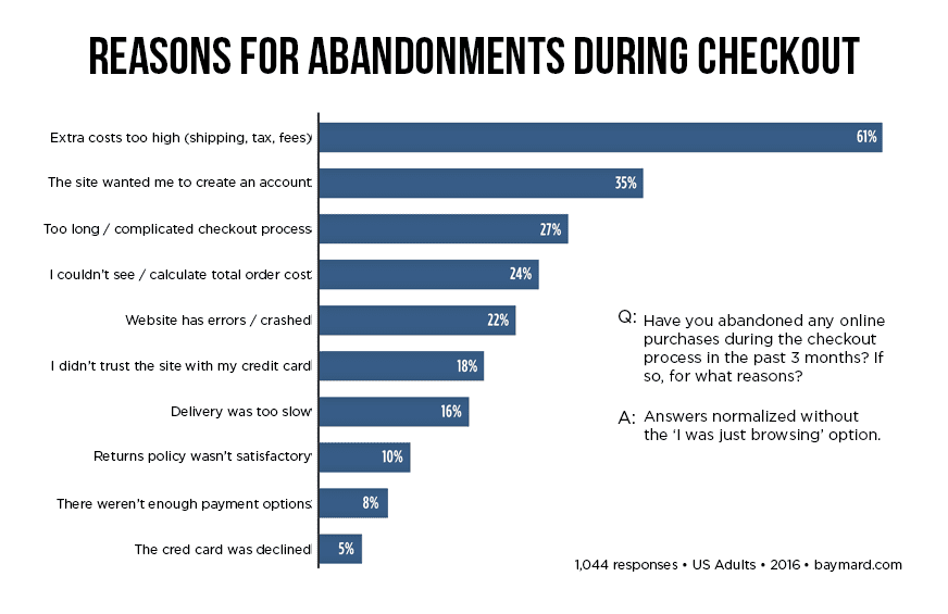
Common Reasons:
- Unexpected costs (shipping, taxes)
- Forced account creation
- Complicated checkout process
- Slow website performance
- Lack of payment options
- Security concerns
Why UX Matters
Many of these issues stem from poor UX design. By improving usability, clarity, and trust, you can guide users more effectively through the purchase funnel.
Section 2: UX Principles That Reduce Abandonment
1. Simplicity
- Minimize distractions
- Use clean layouts and clear CTAs
2. Consistency
- Maintain visual and functional consistency across pages
- Predictable navigation builds trust
3. Feedback
- Show progress indicators
- Confirm actions (e.g., “Item added to cart”)
4. Accessibility
- Mobile-friendly design
- Keyboard navigation and screen reader support
5. Speed
- Optimize images and scripts
- Use lazy loading and caching
Section 3: UX Improvements for the Checkout Process
1. Guest Checkout Option
- Avoid forcing account creation
- Offer social login or email-only checkout
2. Progressive Disclosure
- Break checkout into manageable steps
- Use a progress bar to show completion status
3. Auto-Fill and Validation
- Use browser autofill for address and payment
- Real-time error messages for form fields
4. Trust Signals
- Display SSL certificates, secure payment icons
- Include customer reviews and testimonials
5. Clear Return and Shipping Policies
- Link to policies during checkout
- Use tooltips or modals for quick access
Section 4: Optimizing Cart UX
1. Persistent Cart
- Save cart items across sessions
- Use cookies or account-based storage
2. Editable Cart
- Allow quantity changes and item removal
- Show updated totals instantly
3. Visual Hierarchy
- Highlight total cost, discounts, and CTA
- Use contrast and spacing to guide attention
4. Exit-Intent Popups
- Offer discounts or reminders when users try to leave
- Use subtle animations and persuasive copy
Section 5: Mobile UX Considerations
1. Thumb-Friendly Design
- Place CTAs within reach
- Avoid small tap targets
2. Sticky Cart Buttons
- Keep checkout CTA visible while scrolling
3. Fast Load Times
- Use mobile-first performance optimization
4. Simplified Forms
- Use dropdowns, toggles, and auto-formatting
Section 6: Personalization and Behavioral Nudges
1. Smart Recommendations
- Upsell and cross-sell based on cart contents
2. Urgency and Scarcity
- “Only 2 left in stock” or “Sale ends in 2 hours”
3. Cart Reminders
- Email or push notifications for abandoned carts
4. Gamification
- Progress bars for rewards or free shipping

Conclusion
Reducing cart abandonment isn’t just about fixing bugs—it’s about designing an experience that feels intuitive, trustworthy, and frictionless. By applying UX principles to every stage of the shopping journey, you can turn hesitant browsers into loyal buyers.
Whether it’s simplifying the checkout flow, optimizing for mobile, or adding trust signals, every small improvement adds up. Start by analyzing your current UX, testing changes, and listening to user feedback. The result? A smoother path to purchase and a healthier bottom line.