


Introduction
In the early days of the internet, websites were designed for desktops first. Mobile devices were an afterthought—often served watered-down versions of the full site. But in 2025, that approach is obsolete. With mobile traffic dominating the web and user expectations higher than ever, mobile-first design is no longer a trend—it’s a necessity.
This blog explores why mobile-first design is essential, how it impacts user experience (UX), performance, and SEO, and how businesses and designers can embrace this approach to stay competitive and relevant.
📱 What Is Mobile-First Design?
Mobile-first design is a strategy where websites and applications are designed for mobile devices first, then scaled up for tablets and desktops. It flips the traditional design process, prioritizing:
- Smaller screens
- Touch-based navigation
- Limited bandwidth
- Simplified layouts
This approach ensures that the core experience is optimized for the most common user scenario—mobile browsing.
📊 Why Mobile-First Is Essential in 2025
1. Mobile Traffic Dominates
Over 60% of global web traffic comes from mobile devices. In some regions, mobile usage exceeds 80%.
2. Google’s Mobile-First Indexing
Google now indexes and ranks websites based on their mobile version. Poor mobile UX directly impacts SEO.
3. User Expectations
Users expect fast, intuitive, and responsive mobile experiences. Frustrating mobile UX leads to high bounce rates.
4. E-Commerce Growth
Mobile shopping is booming. Mobile-first design is critical for conversions, especially in retail and services.
5. Social Media Integration
Most social media traffic originates from mobile apps. Landing pages and campaigns must be mobile-optimized.
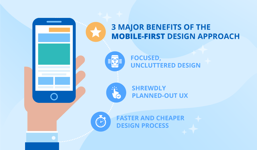
🧠 Benefits of Mobile-First Design
✅ Improved Performance
Mobile-first sites are leaner, faster, and more efficient—leading to better load times and engagement.
✅ Better UX
Designing for mobile forces clarity, simplicity, and focus—qualities that benefit all users.
✅ Higher Conversion Rates
Streamlined mobile experiences reduce friction and boost conversions.
✅ Future-Proofing
Mobile-first design prepares your site for wearables, foldables, and emerging devices.
✅ Accessibility
Mobile-first often aligns with accessibility best practices, benefiting users with disabilities.
🛠️ Key Principles of Mobile-First Design
1. Content Prioritization
Start with the essentials. What does the user need most on mobile?
- Clear CTAs
- Contact info
- Core services or products
2. Responsive Layouts
Use flexible grids and media queries to adapt content across screen sizes.
3. Touch-Friendly UI
Design for fingers, not cursors. Use large buttons, swipe gestures, and avoid hover-only interactions.
4. Optimized Media
Compress images, use SVGs, and lazy-load assets to improve speed.
5. Minimalist Navigation
Use hamburger menus, sticky headers, and collapsible sections to save space.
🧩 Design Techniques and Tools
🎨 Frameworks
- Bootstrap 5 (mobile-first by default)
- Tailwind CSS
- Foundation
🧪 Testing Tools
- Google Mobile-Friendly Test
- BrowserStack
- Lighthouse
📱 Design Platforms
- Figma (responsive design features)
- Adobe XD
- Sketch

💡 Best Practices for Mobile-First UX
✅ Use Visual Hierarchy
Guide users with size, color, and spacing.
✅ Limit Text
Keep copy concise and scannable.
✅ Design for Speed
Aim for sub-2-second load times.
✅ Avoid Pop-Ups
Use modals or slide-ins that don’t block content.
✅ Enable Offline Access
Use service workers and caching for progressive web apps (PWAs).
🛒 Mobile-First in E-Commerce
🛍️ Features to Prioritize:
- One-click checkout
- Mobile wallets (Apple Pay, Google Pay)
- Product filters and search
- Sticky “Add to Cart” buttons
📈 Impact:
- Higher cart completion rates
- Lower abandonment
- Better customer satisfaction
🏥 Mobile-First in Healthcare
🧑⚕️ Features to Prioritize:
- Appointment booking
- Telehealth access
- Emergency contact info
- Secure patient portals
📈 Impact:
- Improved patient engagement
- Reduced call center load
- Enhanced accessibility
🧠 Common Mistakes to Avoid
❌ Designing Desktop-First
Retro-fitting mobile leads to cluttered, broken layouts.
❌ Ignoring Load Time
Heavy scripts and images slow down mobile UX.
❌ Overcomplicating Navigation
Nested menus and small links frustrate users.
❌ Neglecting Testing
Always test on real devices—not just emulators.

🔮 Future of Mobile-First Design
1. Voice-First Interfaces
Mobile-first will evolve into voice-first for smart assistants and wearables.
2. Gesture-Based UX
Swipe, pinch, and tap will dominate over clicks.
3. AI-Powered Personalization
Mobile apps will adapt layouts and content in real time.
4. Foldable and Dual-Screen Devices
Designs must accommodate flexible screen formats.
5. Ambient Interfaces
Mobile-first will merge with ambient computing—apps that work silently in the background.
🧭 How to Transition to Mobile-First
- Audit Your Current Site Use tools like Google Search Console and Lighthouse.
- Redesign with Mobile in Mind Start wireframes at 320px width.
- Test Across Devices Use emulators and real devices for QA.
- Optimize Content Trim unnecessary elements and prioritize clarity.
- Monitor Analytics Track mobile bounce rates, conversions, and engagement.
Conclusion
Mobile-first design is no longer a trend—it’s the standard. In 2025, users expect fast, intuitive, and responsive mobile experiences. Businesses that embrace mobile-first design will not only improve performance and SEO but also build trust and loyalty with their audiences.
Whether you’re launching a new site or revamping an old one, start with mobile. Because in today’s digital world, mobile isn’t just first—it’s everything.